Trying to pick a favorite illustrator seems to me, to be a near impossibility. I can only think of who has been influential to me and most of these names are from the comic book realm. I could go on and on about how much I love Tim Sale's character design or about just how good Dave Mazzuchelli is, but I don't want to. I want to instead talk about an artist who has been, as of the past few years, forgotten. If you mention his name most hardcore comic fans will smile and get pretty excited, but on average the name isn't heard much. and the name is, Brian Bolland.

Bolland was first introduced to me as the artist that brought Alan Moore's Killing Joke to life and I have had a soft spot for him ever since. The cover to the book is certainly horrifying (evermore so upon reading the book) and his dramatic lighting of the scene works wonderfully. The level of detail he has brought into the pose is great and, even if we knew nothing of the Joker character, the illustration still underscores so many aspects of the character. We sense the danger and the twisted psyche of the figure before us. One eye is blocked by the camera and the other is nearly completely closed, but the hint of a highlight on the darkened globe inside his head is very effective. The way the metacarpals in his hand pop so dramatically emphasizes the extreme pose of the figure. The composition is nice, and keeps me involved with the piece as a whole. with this particular piece I would have to criticize the size of the figure's head, which seems just a few sizes to large. This of course would be something I could find passable in a more stylistic drawing, but this image feels so grounded in a firm reality that I find it a bit distracting.

The next image in the set is the one that I find to be the weakest of the bunch. As is always the case, texture is completely under control here. The frayed and straw-like nature of the hair is perfect. The grotesque proportions and skin texture of the figure is excellent. The starkness of the characters tuxedo is also nice, but the problem seems to be with how the two come together. Because of the sharp white of the character's shirt, I am instantly drawn to the figure's chest and have to fight to look back up. more often than not, my gaze is funneled down the front of his shirt and completely off of the image. Here, i feel that Bolland's daring compositions have run amuck and left us with an image that is a bit hard to look at. Of course, thematically, it could be the point. It may be that he is consciously diverting our eye. We are left with a faint memory of the figure's features, but nothing concrete. our own imaginations then contribute to his ghoulishness.
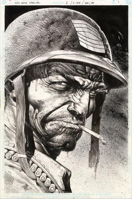
The strongest image of the set has to be of good old Sargent Rock. The textures and the proportions are beautiful. His pen work is creating tension. It feels frenetic, but somehow completely controlled. He applies a lot of nifty little technical tricks that really add to my enjoyment of the piece as a whole. Saying anything more is pointless. The image speaks for itself.
And so does Brian Bolland, through his tremendously detailed artwork. I do love his work and I certainly do wish i heard his name more often.
No comments:
Post a Comment